Tell a compelling story using data visualization in marketing communications.
Data Visualization in Marketing: Why You Need It + Examples
The ubiquity of data is a game changer for those of us in marketing. Aside from informing our strategies – both in real-time and YOY – data is the linchpin for growth, an edge over competitors.
Yet data can also be overwhelming, especially when it’s used for reporting or communicating an idea or approach. Thankfully, we have data visualization in marketing to illustrate complex ideas and make it easier for people to digest information quickly.
What is Data Visualization?
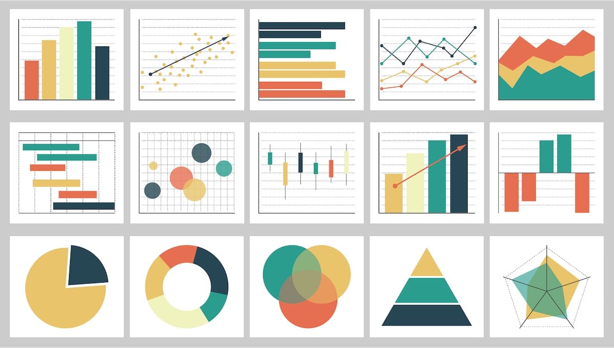
Data visualization is the process of illustrating data with graphic elements, such as graphs, charts, timelines, infographics, and icons. This process helps marketers distill important yet complex data into a format that’s visually pleasing as well as easily understandable.
Why Marketers Need Data Visualization
There are two scenarios where this process is helpful: within the marketing team, and with clients who want to understand how well their marketing is performing – so they can apply that data to future decisions and budgets.
Nowhere is this more clearly valuable than with Google Search Console’s introduction of bubble charts:

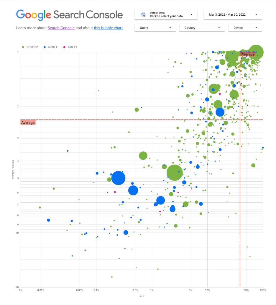
Bubble charts are an example of data visualization in marketing tech. (Source)
Bubble charts help you understand which search queries are performing well for your site, according to Google. Rather than viewing a long list of keywords ranked by performance, this chart is a more engaging way to quickly understand the data and take action where needed.
It’s not only helpful for marketing teams leveraging data to inform strategy, but charts like this are also incredibly valuable when communicating with clients who may get overwhelmed by loads of data or simply don’t have a lot of time to sift through reports.
Examples of Data Visualization in Marketing
Airbnb
Airbnb tapped data visuals to explain new product categories, using simple icons to highlight the features at-a-glance. Combining icons with text helps the reader quickly digest what’s new without having to spend a lot of time breaking down information – it’s already been done for them.

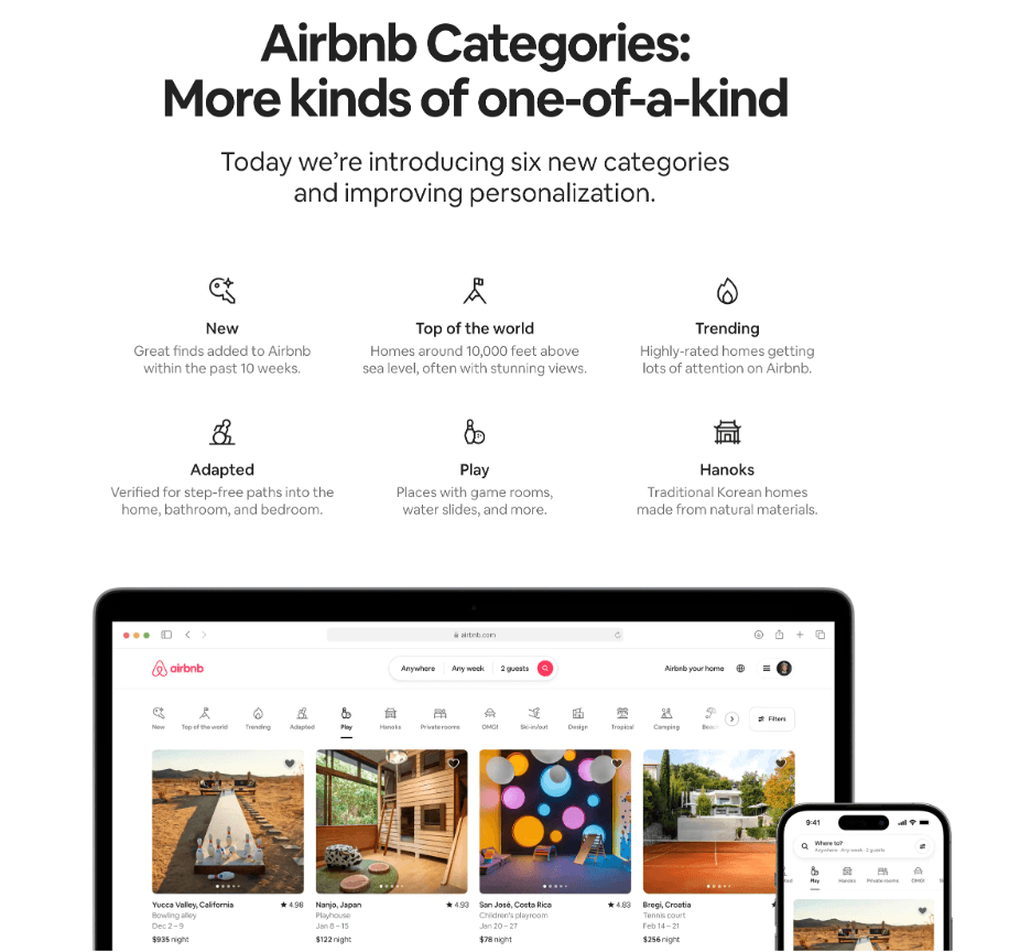
(Source)
Germinate Creative
If your team is responsible for providing reports, like this one designed by Germinate Creative, then you’ll certainly want to leverage data visualization for your marketing teams and clients. This report breaks down lots of information with visually engaging elements that tell a story, an important task for its audience of stakeholders, legislators, and local and national arts education organizations.

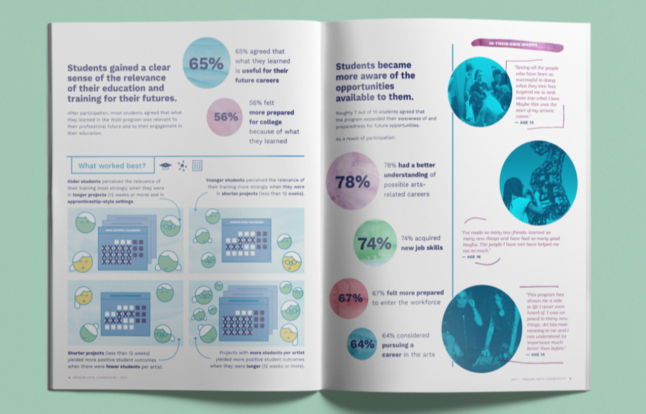
Annual reports benefit from visuals to represent large amounts of data. (Source)
BlueJeans
Our friends over at BlueJeans (disclaimer: they’re a client of ours) created this highly engaging infographic during the pandemic to distill data into a visual story. It’s one more way to use data visualization in marketing to communicate big ideas, and you can use these in various channels like social media, email marketing, and blogs like this was featured in.


Infographics draw inspiration from data to create compelling visuals. (Source)
Let’s Talk about Your Data Visualization
If you’re feeling inspired after reading this post, then let’s explore how visuals might help you represent complex ideas or tell an important story. Reach out for a time to chat.

